1. The Basics of Color Theory
Color theory is the foundation of effective UI design. It involves understanding the relationships between colors, their emotional impact, and how they influence user experience.
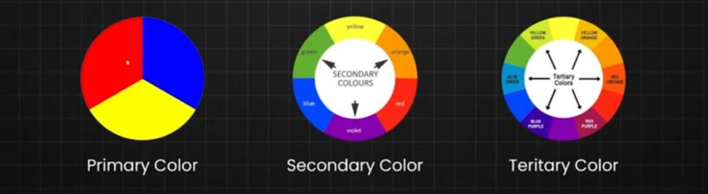
Primary Colors
-
- Red, Blue, Yellow – The base colors that cannot be created by mixing other colors.
Secondary Colors
-
- Green, Orange, Purple – Created by mixing primary colors.
- Red + Yellow = Orange
- Blue + Red = Purple
- Yellow + Blue = Green
Tertiary Colors
Tertiary Colors are the colors formed by combining a primary color with a secondary color, but not all primary colors can be combined with all secondary colors, you need to choose two colors that come next to them on the color wheel to can obtain a Tertiary Color.
Here You Can see All six tertiary colors and how to get them
- Red + Purple = Red-Purple (magenta)
- Red + Orange = Red-Orange (vermillion)
- Blue + Purple = Blue-Purple (violet)
- Blue + Green = Blue-Green (teal)
- Yellow + Orange = Yellow-Orange (amber)
- Yellow + Green = Yellow-Green (chartreuse)
Color Wheel Explained
If you had studied Painting or any lesson related to art you might have seen the color wheel, which was created in 1666 by Isaac Newton in a schematic way to mix the different colors appropriately.
And what is the color wheel? A color wheel is a tool that helps you to combine appropriately the colors, and its represented by a circle formed by primary, secondary, and tertiary colors where you can see in a graphic way how the different colors interact with each other.

Hue
Hue is the word used to refer to the standard set of colors in their pure form and as you can find them on the color spectrum, the six primary and secondary colors have Hue, and not all colors have hue as white and black.
Shade
The shade is referred to the color that you get by adding black to any of the hues mentioned before.
Tint
A tint is the opposite of shade, and the tint is the color that you get by adding white to any hue, and any color has a range of shades and tints.
Tone
Tone and saturation are synonyms but usually, the tone is used for painting and saturation for digital images, and Tone or saturation is a color that results of mixing a pure color (hue) with any neutral/grayscale color including white and black, so by this definition, we also consider all shades and tints to be toned.
What Are Color models (CMYK RGB)
Once we already know the definition of primary, secondary, and tertiary colors and the color wheel theory, we need to understand that colors have two different natures, additive colors are tangible colors and subtractive colors that are produced by light. That is why you have heard about RGB and CMYK, now let’s explain these two color models.

RGB Color Model
RGB Color model stands for Red, Green, and Blue and is mainly used for electronic displays including computers and smartphones, and is based on the additive color model of light waves.
RGB is created by using scales from 0 to 255 in three colors R, G, and B where 0 in all of them is the lack of light and that means the color black and where 255 is the complete light and the white color.

CMYK Color Model
CMYK Color model stands for Cyan, Magenta, Yellow, and Key (Black) and it is the subtractive color model and that means that you get the colors by subtracting the light of it and it’s used in printing and that is why these colors are listed on your ink cartridge from your printer.
CMYK works on a scale from 0 to 100 on every color mentioned before, where all of them are on 0 that means that you didn’t subtract any light and you get white color, but where all of the colors are on 100 that mean that you have subtracted all the light and you get the black color.

Color Harmony
Color harmony is an orderly and pleasing arrangement of the colors in design for users to feel more pleased and calm when they see the result because not all colors work well together and when you combine not harmony colors that give a feeling of chaos and disgust.
That is why is vital to understand how colors work together to make more attractive your design and now I will show you the best color schemes that are proved to work effectively.
Monochromatic
The first color scheme is the easiest one because you can’t go wrong with combine different shades and tones from one color, and the monochromatic scheme as the name says combine different shades from one color to create an attractive design.

Analogous
Analogous harmony scheme is based on combined colors located right next to each other on the color wheel, and this color scheme it’s used a lot when your design doesn’t need contrast and is used many times on web design and banners backgrounds.

Complementary
To create a complementary color scheme you need to combine colors placed in front of each other and this color scheme is used to create high contrast feeling in opposition to analogous and monochromatic schemes.

Split-Complementary
Split Complementary color schemes is also used to create contrast feeling in your design but this color scheme uses three colors instead of two as complementary, and you need to choose one color and pick the other two who are adjacent to its opposite color, split complementary color scheme allows you to use more colors in your design and create a soft contrast.

Triadic
On Triadic color scheme, we use three colors which are equidistant on the color wheel, but when you use this color scheme it’s important to use one color as dominant and the other two as accents to save the balance, and this color scheme is used when your design needs more colors.

Tetradic/Double-Complementary
Tetradic or double complementary color scheme is the most complex color scheme to use because it uses four colors that are complementary pairs from the color wheel, this color scheme is hard to use because is difficult to balance all the four colors, but when you if you can harmonize this color schemes the results are really beautiful and your design looks very professional.

3. Color Harmony & Schemes
Monochromatic
-
- Variations of a single color.
-
- Creates a clean, cohesive look.
Analogous
-
- Colors next to each other on the color wheel (e.g., Blue, Blue-Green, Green).
-
- Gives a natural, harmonious feel.
Complementary
-
- Opposite colors on the wheel (e.g., Blue & Orange).
-
- High contrast, used for call-to-action (CTA) buttons.
Triadic
-
- Three evenly spaced colors (e.g., Red, Yellow, Blue).
-
- Vibrant yet balanced.
Image Idea: A visual representation of different color schemes using a UI design example.
4. Color Psychology in UI Design
Each color triggers different emotions and behaviors:
-
Red: Passion, urgency, excitement (used for warnings, sales).
-
Orange: Energy, warmth, friendliness.
-
Yellow: Optimism, happiness, attention-grabbing.
-
Green: Growth, nature, health (often used for success states).
-
Blue: Trust, calm, professionalism (commonly used in tech & finance).
-
Purple: Luxury, creativity, sophistication.
-
Black: Elegance, power, authority.
-
White: Simplicity, cleanliness, minimalism.
Image Idea: A UI color psychology chart with real-world brand examples.
5. Accessibility & Readability
Contrast Ratios
-
- Follow WCAG guidelines for contrast.
-
- Minimum 4.5:1 for normal text, 3:1 for large text.
-
- Use tools like WebAIM Contrast Checker.
Color Blindness Considerations
-
- Use color-blind simulation tools.
-
- Don’t rely solely on color; add text/icons.
Image Idea: Examples of accessible vs. inaccessible UI color choices.
6. Practical UI Design Tips
Use color to guide users (e.g., red for errors, green for success).
Maintain visual hierarchy (bright colors for CTAs, neutral for backgrounds).
Keep consistency across the UI (use a brand palette).
Test colors on different devices to ensure they appear as intended.
